
2024
Onboarding
The project
A creative sprint to redesign the onboarding experience for Reframe, the leading health app in its category, focusing on balancing scientific credibility with engaging user experience through visual and interaction design.
The problem
Users need a visually compelling onboarding experience that builds trust through clear, evidence-based guidance while making them feel supported and confident at every step.
The solution
Update visual and interaction design to communicate key values and reinforce brand confidence.
Constraints
24-hour timeline requiring decisive action
Limited resource availability necessitating use of existing design kit
Need to work with pre-made assets
Balance between interaction design and static asset limitations


Research
Analysis of the existing onboarding process revealed several strengths and opportunities:
Effective breadcrumb navigation despite multiple steps
Strong, empathetic messaging with authoritative tone
Clean, utilitarian design foundation
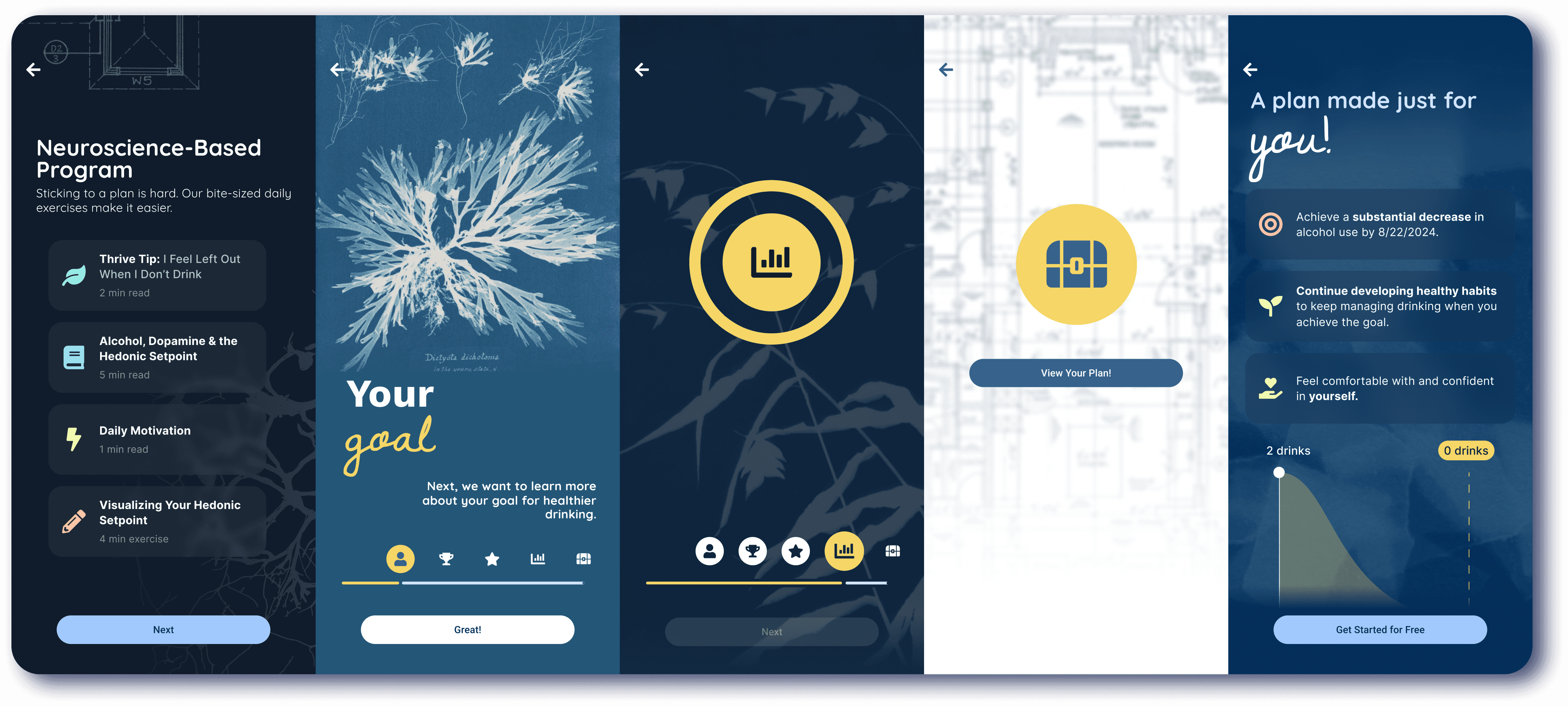
Design Solution
Selected cyanotype photography as the central theme for its ability to:
Bridge science, art, and engineering
Reinforce scientific credibility through historical context
Evoke empathy through calming blue tones
Support minimalist design principles

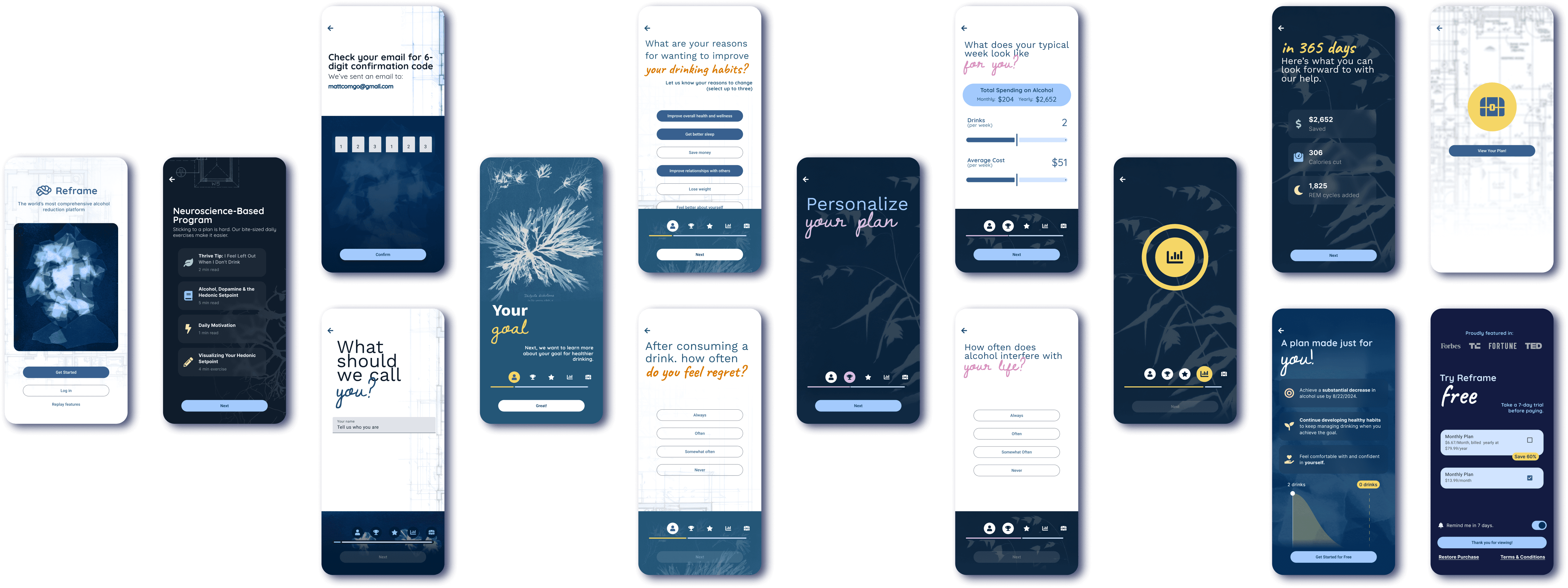
Key Elements
Start Screen: Featuring an evocative cyanotype human head image allowing personal interpretation
Interactive Screens: Human-centered design with clear request-option-action flow
Progress Tracking: Dynamic footer with visual journey markers
Call to Action: Prominent, personalized messaging with accent typography
Implementation
Selected cyanotype photography as the central theme for its ability to:
Material Design framework for consistent UI elements
Smart animation system for screen transitions
Structured layout system for form components
Custom typography and color palette aligned with brand

Prototyping
Full onboarding flow illustration
Interactive components
Layout and imagery animations
Successes
Successfully balanced scientific credibility with engaging design
Created cohesive visual language through cyanotype theme
Maintained efficient user flow while enhancing visual appeal
Areas for Improvement
Animation optimization
Progress bar uniformity could be enhanced
Typography refinement